Shot placement heatmaps — what they can and cannot tell you
The shot density map in pointMoA: how it is built, what the colour really means, why two maps are not comparable, and how many hits it takes before the map shows a pattern rather than the holes themselves.
A heatmap shows where your hits sit more densely — relative to each other, on that one map. It is not a photograph of the target and not an absolute scale: the hottest colour always marks the peak of that particular map, whether it came from five hits or a hundred.
Two things are worth knowing before you look at one. Below roughly fifty hits, the map shows individual holes, blurred, rather than a pattern. And the colours of two maps must never be compared — each is normalised on its own.
The rest of this article is about what you can read from it.
How pointMoA builds the map
Five steps, all from the app's code:
- The window. The bounding box of the hits is squared off and padded by 35%. If the group is tighter than 20 mm, the window still will not go below 20 mm — a floor, so that a single hole does not produce a map one millimetre across.
- The grid. Always 32 × 32 cells, regardless of hit count or group size. Each hit falls into one cell.
- The blur. A separable Gaussian blur with σ = 1.5 cells, kernel radius 5 cells. The edge is replicated rather than zeroed.
- Normalisation. The whole map is divided by its own maximum, so the peak is always 1.
- The bands. The app does not draw 32 × 32 squares; it draws four contours at relative density 0.2 / 0.4 / 0.6 / 0.8, computed with marching squares. That is why the map looks smooth rather than pixelated, and why the same shape goes into the PDF unchanged.
No hits means no map. One hit does produce a map — a useless one, but it produces it.
The colour is always relative
This is the most common misreading and the easiest to check. Three maps from the same distribution, differing only in hit count:
| Hits | Hottest colour | Density at the peak |
|---|---|---|
| 5 | full saturation | 0.113 hits per cell |
| 20 | full saturation | 0.179 hits per cell |
| 100 | full saturation | 0.857 hits per cell |
The same red, a sevenfold difference in density. The app's help text says it plainly: the colour is not a probability percentage and not a scale for comparing separately normalised maps.
The practical consequence: "today's map is redder" means nothing. Compare sessions with numbers — P50 area, mean radius — not with saturation.
The resolution depends on your group
The grid is always 32 × 32 cells and the window is fitted to the group, so the cell and the blur grow with the dispersion:
| Group extent | Map window | Cell | Blur σ |
|---|---|---|---|
| 20 mm or less | 27.0 mm | 0.84 mm | 1.27 mm |
| 30 mm | 40.5 mm | 1.27 mm | 1.90 mm |
| 43 mm | 58.0 mm | 1.81 mm | 2.72 mm |
| 80 mm | 108.0 mm | 3.38 mm | 5.06 mm |
| 150 mm | 202.5 mm | 6.33 mm | 9.49 mm |
| 300 mm | 405.0 mm | 12.66 mm | 18.98 mm |
Two consequences, neither obvious:
- A tight group's map is not "sharper". It looks exactly as smooth as the map of a group three times larger, because the blur scaled with it.
- Two maps are not at the same scale unless the groups are. When comparing, read the distance label and the group size, not the picture.
Below 20 mm the floor kicks in: the window stays at 27 mm and the cell at 0.84 mm. A blur of 1.27 mm is then smaller than a .223 bullet hole (5.7 mm), so the map starts drawing individual holes.
Five hits are not a pattern
This is where the map is easiest to read backwards.
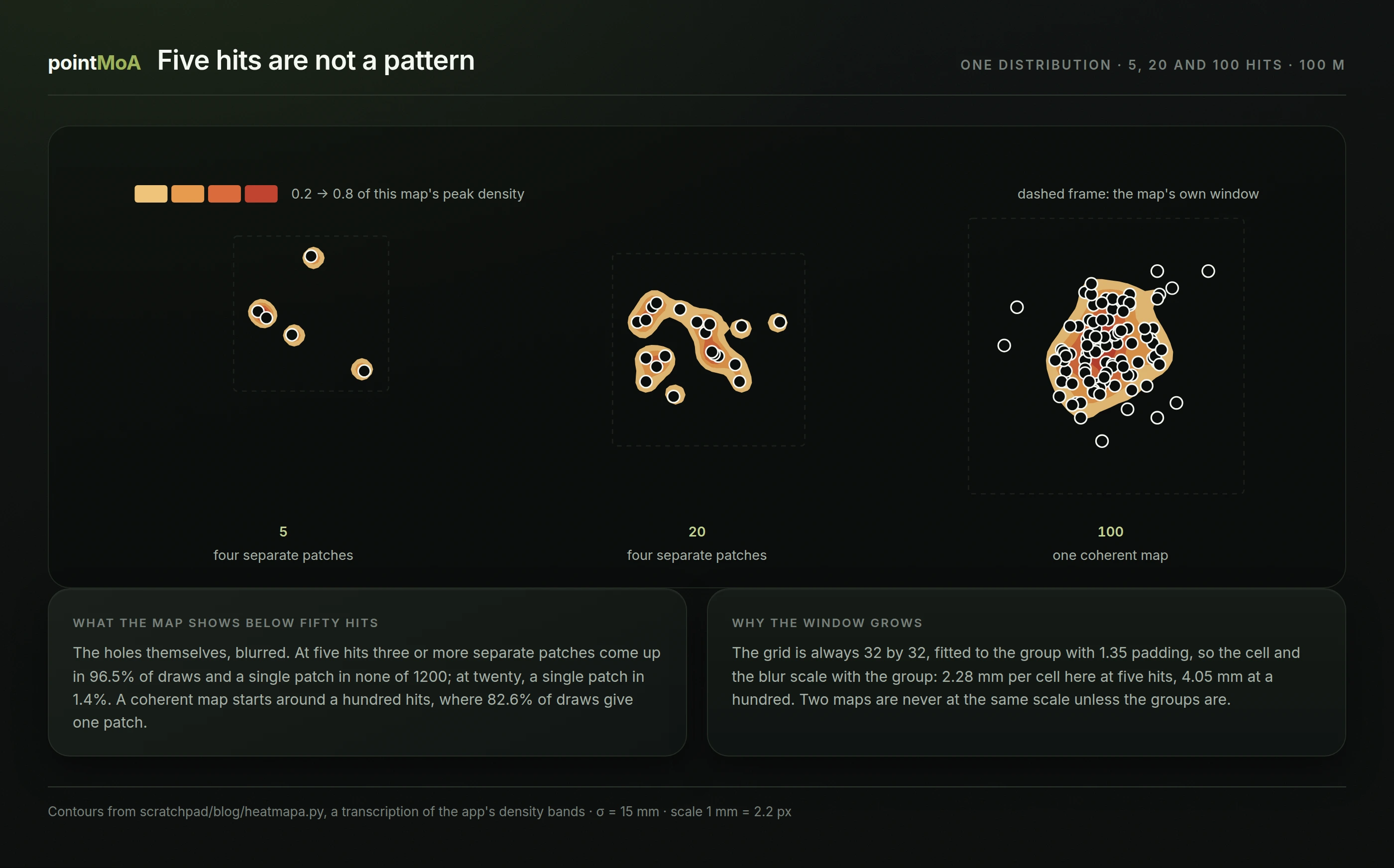
We ran the simulation: 1200 draws for each hit count, hits from a two-dimensional normal distribution. We count patches at the lowest band (0.2) — exactly what you see on the target as separate blobs.
| Hits | Patches: median | Share of maps with one patch | With three or more |
|---|---|---|---|
| 3 | 3 | 0.2% | 81.5% |
| 5 | 4 | 0.0% | 96.5% |
| 10 | 5 | 0.2% | 96.2% |
| 20 | 4 | 1.4% | 90.2% |
| 50 | 2 | 36.9% | 32.7% |
| 100 | 1 | 82.6% | 2.1% |
Read it like this: at five hits the map will almost certainly break into several patches — not because you are shooting two groups, but because five holes a dozen millimetres apart, blurred by 2–3 mm, stay five holes. A single coherent patch at five hits did not occur once in 1200 draws.
A coherent map appears only around a hundred hits. That is far more than a meaningful P50 needs (twenty) or than measuring group size needs (the measurement guide says ten), and it follows directly from the map trying to show the shape of the distribution rather than its size.
Where the centre actually is
It is tempting to treat the hottest point as the centre of the group. At a small hit count that is a bad idea — the hottest cell wanders:
| Hits | Peak-to-truth distance (median) | 90th percentile | At σ = 15 mm |
|---|---|---|---|
| 3 | 1.24 σ | 2.23 σ | 19 mm |
| 5 | 0.99 σ | 1.83 σ | 15 mm |
| 10 | 0.88 σ | 1.64 σ | 13 mm |
| 20 | 0.73 σ | 1.30 σ | 11 mm |
| 50 | 0.56 σ | 1.01 σ | 8 mm |
| 100 | 0.46 σ | 0.80 σ | 7 mm |
For the centre, use the mean of the coordinates — the mean point of impact the app uses for the zeroing correction (POA and POI). The map is about shape, not position.
What the map sees and the ellipse does not
P50 and P90 describe the distribution with one blob, because they assume one hump. The map assumes nothing — and that is its advantage.
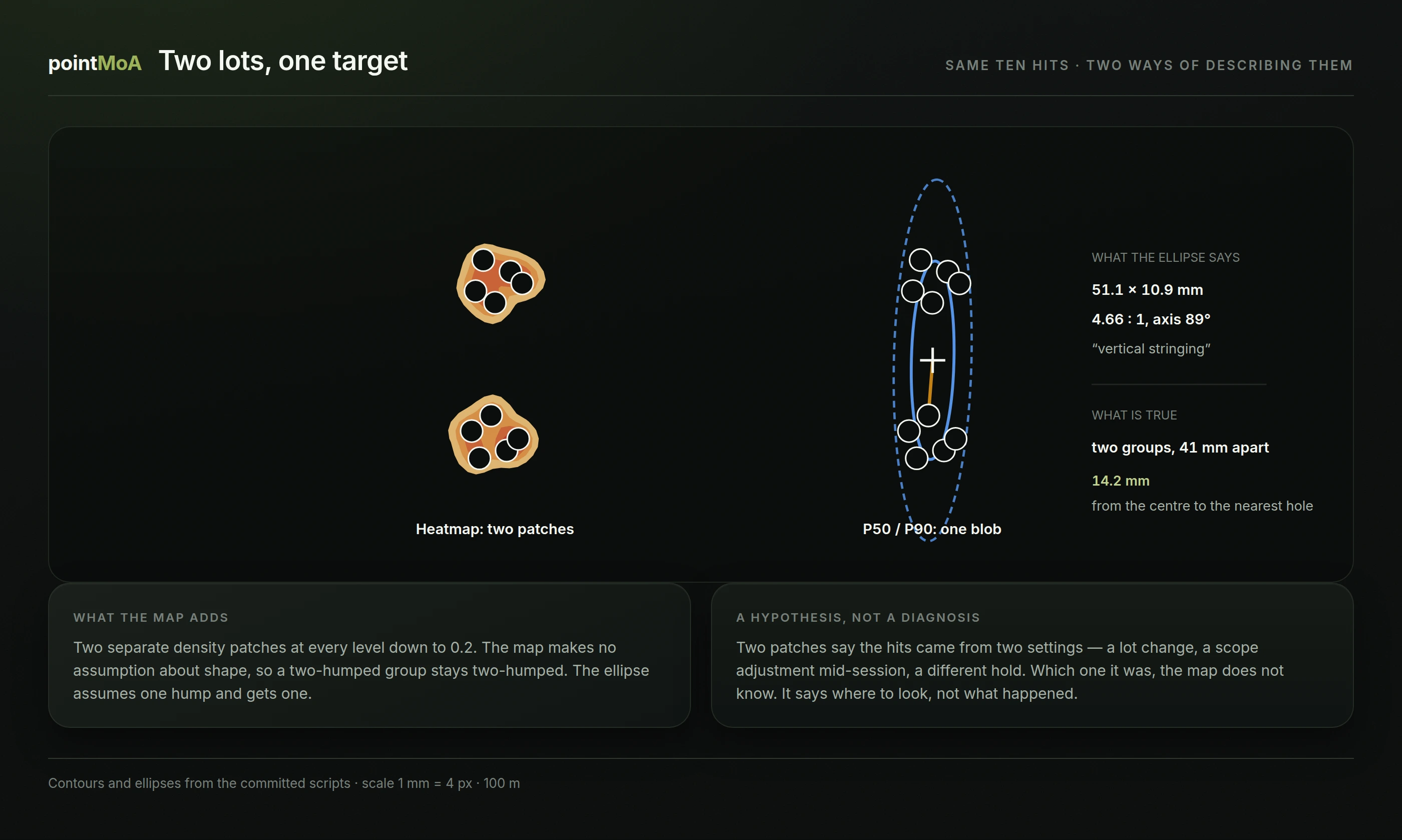
Ten hits, two lots of ammunition with different points of impact. The ellipse model turns that into a single blob of 51.1 × 10.9 mm, elongation 4.66 : 1, axis vertical — the textbook description of "vertical stringing", which is not what is happening here. The map draws two separate patches at every level down to 0.2.
The strongest evidence that the ellipse is wrong sits at its centre: the mean point of impact falls 14.2 mm from the nearest hole, on paper where not one shot landed.
That is the division of labour between the map and the ellipses: the ellipse gives numbers — axes, area, elongation — and suits comparison over time. The map gives shape and can reveal that the ellipse model does not fit at all.
What you can read, and what you can only suspect
This article's brief demands something worth saying outright: the map does not diagnose. It says where to look. Below is what shows up and the hypotheses it supports — to be tested, not believed.
| What the map shows | What might be behind it (to check) |
|---|---|
| two separate patches | a lot change, a turret turned mid-session, two positions |
| a patch offset from the aim point | a stale zero, a distance other than the zeroing one, a different mount |
| a patch clearly stretched vertically | muzzle velocity spread, breathing, an unstable rest |
| a patch clearly stretched horizontally | wind, trigger pull to the side, a loose hold |
| one patch with a tail | a flier, or a string fired after conditions changed |
Three caveats to that table, all of them material:
- Elongation in a small group usually means nothing. A perfectly circular distribution typically yields a 2 : 1 ellipse at five hits, and one in twenty exceeds 5 : 1. The thresholds above which shape stops being chance are in the article on P50 and P90.
- Direction is not cause. Vertical stretch is consistent with velocity spread, and equally with breathing and several other things. The map does not separate causes — an experiment does: change one thing and keep shooting.
- The offset is a separate quantity. The map shows the distribution about its own centre; where that centre sits relative to your point of aim is a separate article.
Comparing sessions
The map is a poor tool for comparison and a good one for recognising shape. Three rules:
- Do not compare colours. Each map is normalised separately, so red on both means only "the peak of this map".
- Do not compare "sharpness". The blur scales with the group, so a tight group's map looks exactly as smooth as a scattered one's.
- Compare numbers. P50 area, mean radius, extreme spread — in the same unit and at the same distance, or in MOA (how to convert).
The map answers "is this distribution even one distribution". The numbers answer "is it smaller than last time".
Limits
- The map has no absolute scale. Colour is neither a percentage nor a density in hits per square centimetre.
- The blur is fixed in cells, not millimetres. Changing your dispersion changes the map's resolution, though nobody adjusted anything.
- A flier moves the whole window. One distant shot enlarges the bounding box, so the rest of the map gets finer. The app does not discard outliers on its own, and rightly so — that is the shooter's call.
- Maps must not be pooled across distances. Targets without a recorded distance stay out of the dispersion analysis.
- Several hits through one hole are one hole. The map counts the hits you marked, so if two bullets went through the same opening and you recorded one, the map sees one.
The short version
- The colour is relative to that one map — two maps cannot be compared by eye.
- The grid is always 32 × 32 cells fitted to the group, so resolution grows with dispersion.
- Below fifty hits the map shows blurred holes rather than a pattern: at five hits it breaks into several patches 96% of the time.
- The hottest point is not the centre of the group — at five hits it lands a typical 15 mm off the truth.
- The map's biggest advantage over the ellipses: it can show a two-humped distribution that an ellipse merges into one elongated blob.
Frequently asked questions
How many hits does a useful heatmap need? To recognise shape, on the order of fifty; a coherent map appears around a hundred. Below twenty, the map almost always breaks into separate patches around individual holes.
Why does my map have several patches from a single string? Because at a small hit count that is what happens almost every time. At five hits, three or more patches come up in 96.5% of draws from a distribution that contains no separate clusters at all.
Does red on the map mean I hit there most often? It means that is the highest density on this map. Whether that is "often" in any absolute sense, the map does not say — at five hits the peak is 0.11 hits per cell.
How does a heatmap differ from the P50 and P90 ellipses? The ellipse is a model: it assumes one hump and returns numbers. The map assumes no shape and returns no numbers. For tracking over time the ellipse is better; for checking whether the ellipse model fits at all, the map is.
Can I compare today's map with one from a month ago? Shapes, yes, carefully. Colours and "sharpness", no — each map is normalised separately and has its own window. For numerical comparison use the P50 area or the mean radius.
Will a heatmap show that I am pulling the trigger sideways? No. It will show that the distribution is stretched horizontally — if it is, and if you have enough hits to establish that. The cause is settled by experiment, not by reading a picture.
Turn on the heatmap in the pointMoA additional analysis, or as a layer on the interactive target. Mark your hits, give the target a distance and read the shape — and take the numbers for comparison from the P50 and P90 ellipses beside it. More about the app.